Rock Canyon Coffee Roasters Brand Identity Design
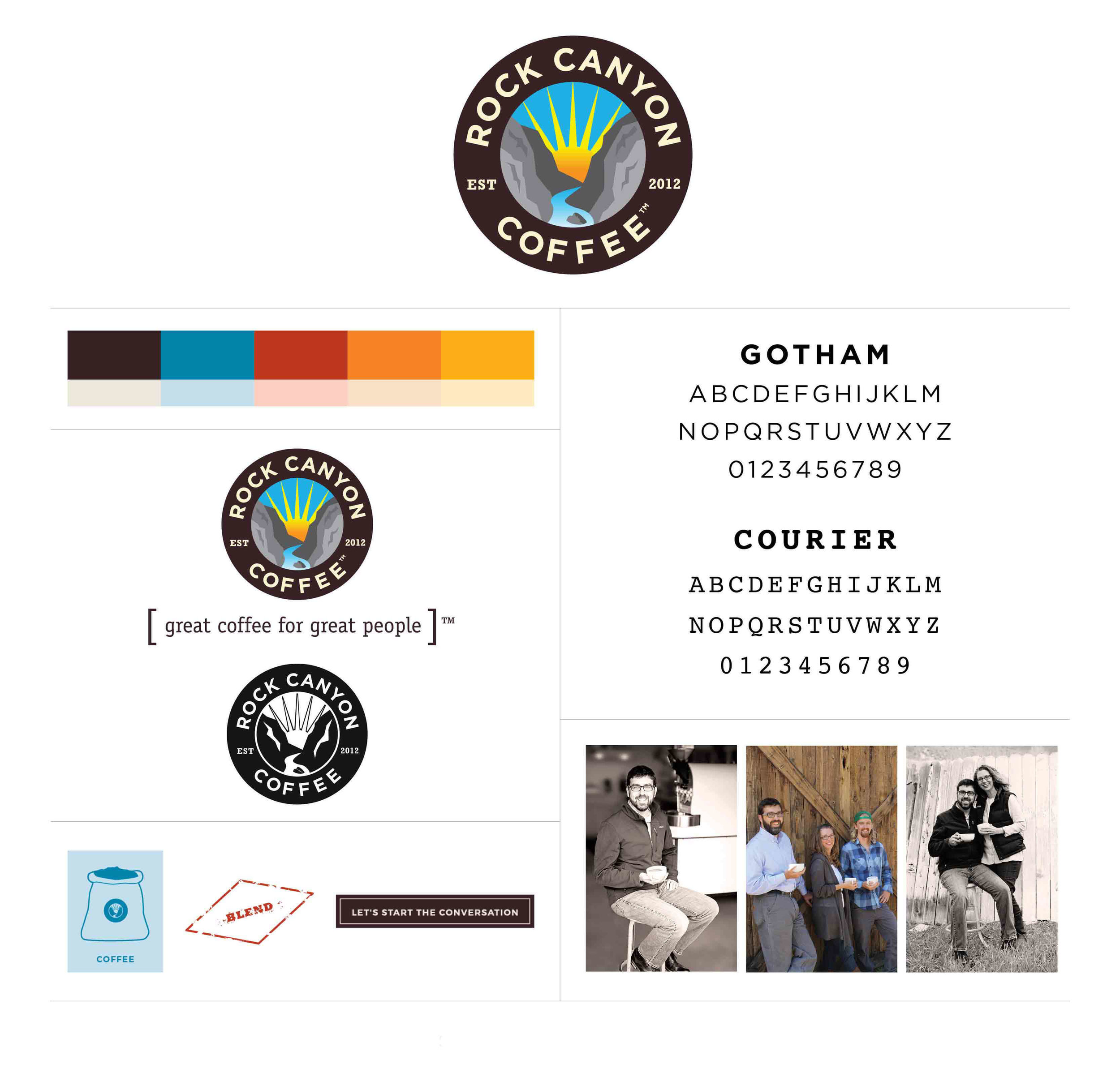
Rock Canyon Coffee Roasters had a logo when they reached out for branding help, but it was time to take their logo to the next level. While the original logo attempted to elicit a sense of history with a serif font and simple, graphic illustration of a sun and river canyon, it didn’t quite take the viewer where Rock Canyon wanted them to go. We swapped out the business name font to a simple, friendly font with a strong historical note that would hold up in reverse on a dark background and balance with the striking artwork. We maintained the shapes of the sun, river and rocks, but added detail and color to them to enhance the imagery and pull the viewer in to the fictional “Rock Canyon” setting. Working with Heidi and Craig we were able to elevate their logo and brand identity to really represent what Rock Canyon Coffee is all about.
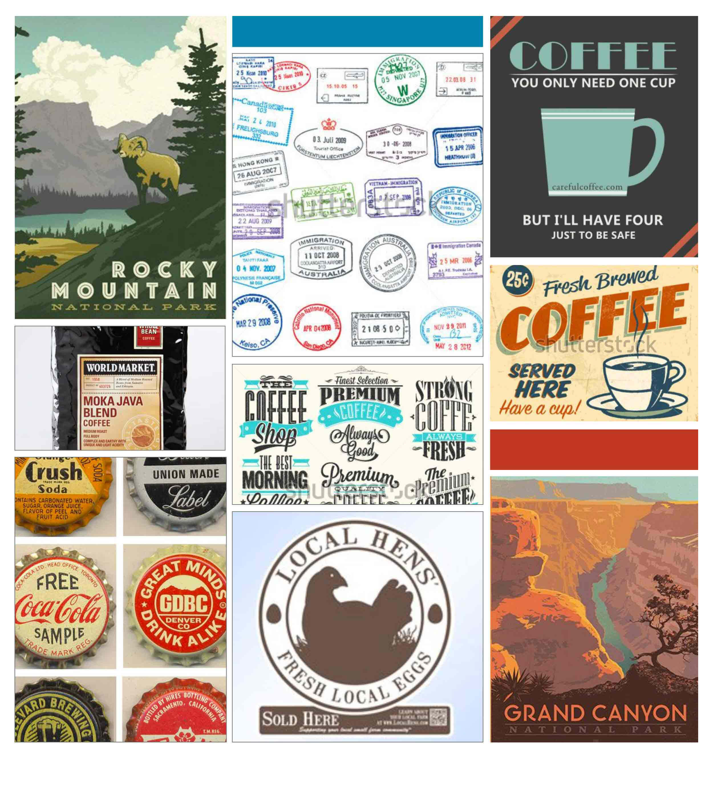
Owner and roaster, Craig Fulmer felt a strong affinity to early national park posters that reflect a simpler time when things like roasting and making coffee were simple, handcrafted processes done slowly and with care. Their inspiration board reflected vintage stamps, retro design and a personable, warm feeling.
We built on the vintage feel with their coffee bags and created labels inspired by old forms and library cards. Their ads were consciously kept simple and clean to balance the more complicated logo imagery. Colors that have a modern take on vintage were pulled from the logo, and photos of partners Heidi, Craig and John were used to emphasize the hand-crafted element and people behind the product.
Rock Canyon has been an ongoing client over the past few years so we’ve had the opportunity to create lots of different collateral pieces together. They’ve been steadily building their business and reaching big goals. It’s been inspirational to watch them grow and I look forward to seeing what’s next for this passionate, dedicated and driven team.
Rock Canyon first became a client of mine while working with two partners (Kimi Mischke and Margaret Mathers) as ithree graphic design, and I have continued working with them as The Qurious Effect.


