Sarah Kuhn Photography Brand Identity
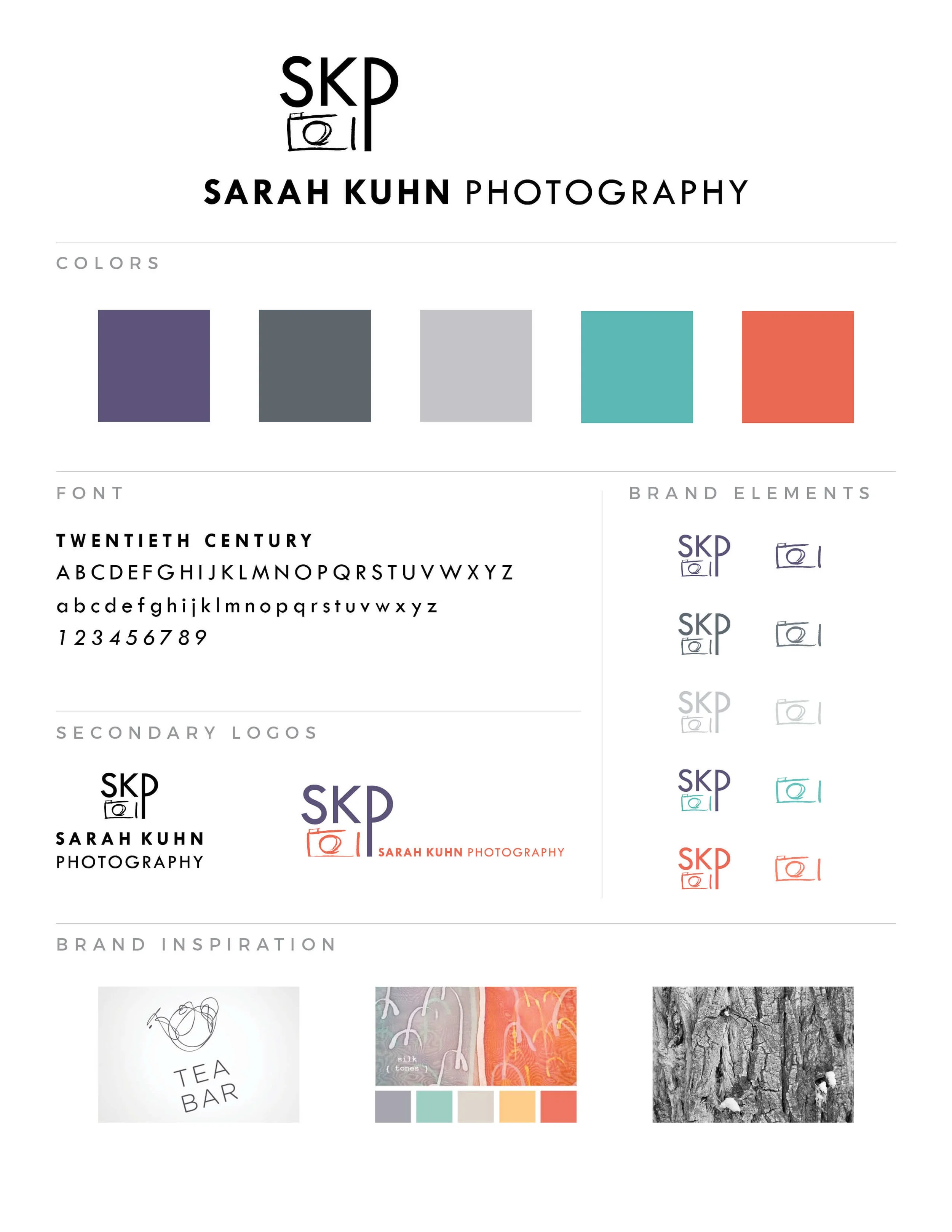
My dear friend Sarah recently launched a family portrait photography business and I was honored to help her start off with a strong brand identity that will serve her business well as it grows into the future.
After Sarah answered the brand questionnaire and shared her visual inspiration, we met to review her answers. Based on Sarah’s photographic style and desired brand personality, she knew her brand identity needed to have a slightly quirky, hand-drawn feel that also spoke to her professionalism and the French phrase “c’est si bon” translated as “it’s so good”. Essentially portraying Sarah as a competent, capable, personable photographer whose mission is to find and capture the quirkiness of each individual in a family while also showing the affection between the family members.
Sarah’s logo combines a quirky, hand-drawn camera icon with sophisticated type that has been manipulated to reflect her unique point of view.
Once the black and white version of the logo design was complete, we moved to picking colors that supported Sarah’s brand personality and settled on a lovely modern set of colors with a fun pop of coral.
We concluded with logo variations and the mark with just the business’ initials serving as elements that can be used in various places such as social media and watermarks on photos.
I’m thrilled with how Sarah Kuhn Photography’s brand identity feels just right for her personality and artistic skill and look forward to watching her business grow.

